Superellipse: One Corner for Every Surface
[01]TL;DR
[02]Everything on this page with a corner is drawn by the law it describes, at the moment the page loads. Nothing here is a picture of the system except the three sketches.
Everyone knows rounded corners
[03]Rounded things read as friendlier than sharp ones. That is close to a reflex rather than a taste: we find soft contours approachable and hard edges guarded, and every interface of the last fifteen years has leaned on it. The rounded corner is so well known that nobody looks at it any more.
I started looking, and I found it overdone. A radius has two failure modes and no middle. At a low radius the corner is still an edge with the sharpness filed off, and it reads as edgy. At a high radius the corner takes over the shape, and a card starts to look like a lozenge or a sticker: cartoonish, the way a rounded font is cartoonish. The band in between, where a corner is neither, is narrow, and it moves with the size of the element.
The corner is the one part of a shape you are not supposed to notice. Both ends of the radius make you notice it.
The corner Apple drew
[04]Apple saw the same thing and, from iOS 7 on, smoothed it. The continuous corner eases the circular arc into the edge over a longer run, and Figma later shipped the same idea as a corner smoothing slider. It is better than the arc. I used it for years.
It still felt unnatural to me, and it took a while to say why. The curve of the corner is perfect, a piece of a circle, and it runs into an edge that is perfectly straight. At the join the curvature drops to zero in one step. Smoothing pushes the join out and softens it, but the join is still there, and the eye finds it. The flat between two corners reads as if it bows inward, as if the edge is concaving between the shoulders. That is an illusion, the edge is straight, but an illusion the eye cannot switch off is a fact of the design.
The tell...Draw the edge's line through the corner as a guide and look at the flat. On the arc the shoulders sit high and the middle seems to sag. On the curve I ended with, the edge never goes truly straight and never truly turns, so there is no shoulder for the middle to sag against.
Sketches
Mashing the square
[05]So I set out to fix it, and then to scale it. The fixing started on paper. I drew the perfect rounded square over and over and pushed on it: fatter through the shoulders, so the flat stopped reading as concave, and rounder through the corner, so the corner stopped reading as a separate piece. What I wanted was a shape where the edge and the corner are one curve rather than two joined ones.
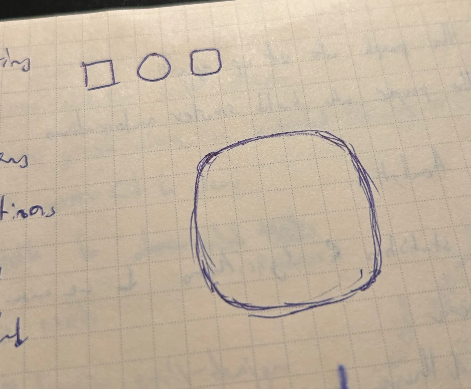
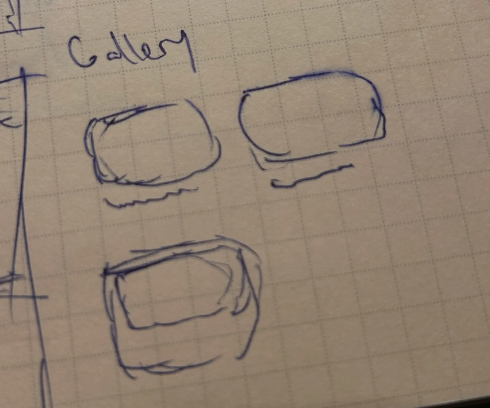
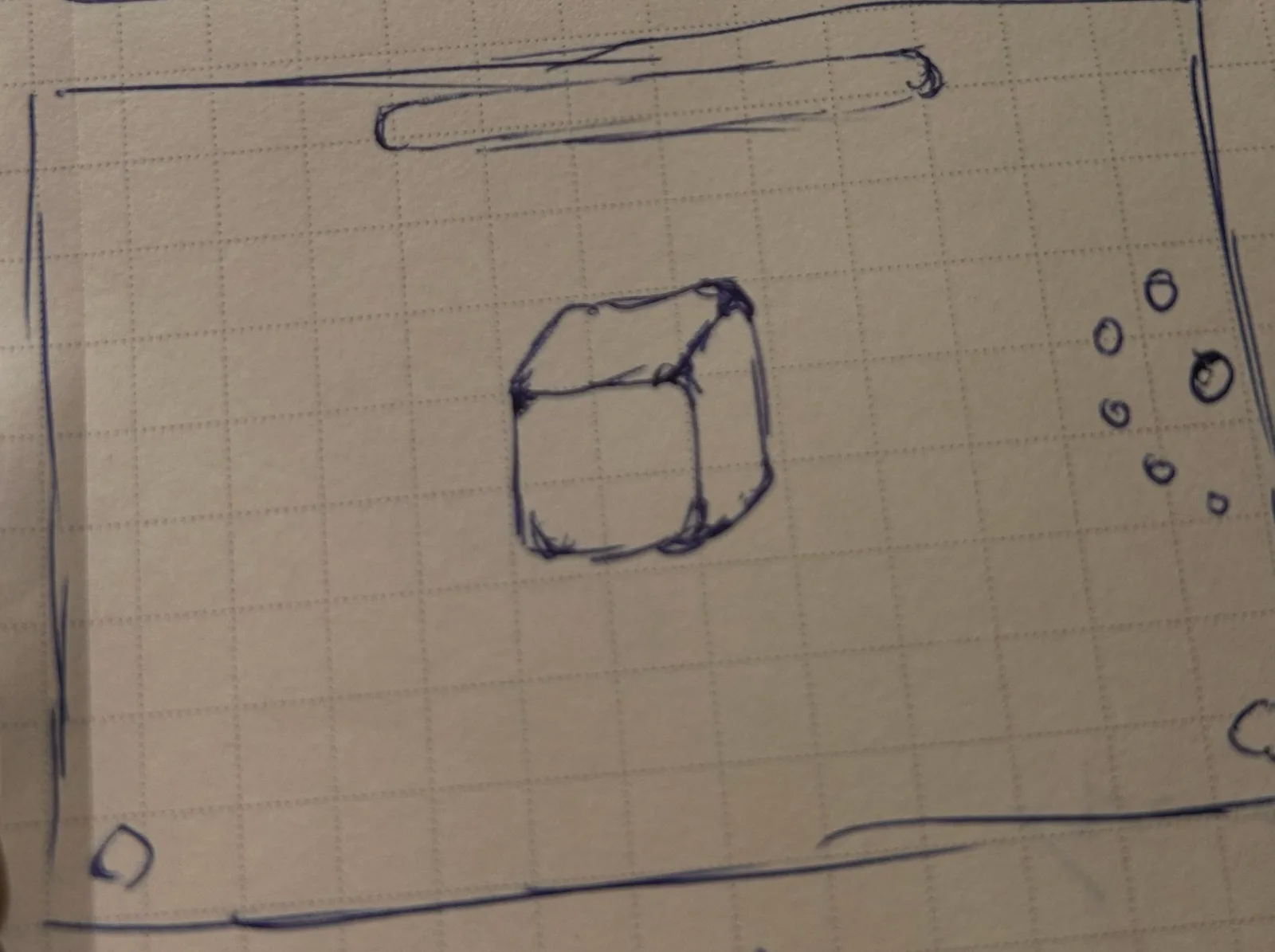
Two things came out of the sketches. The corner I liked was the same corner at every size, which meant it was a proportion rather than a number of pixels. And it had to survive being stretched: the gallery cards are three different aspects, and the corner on a wide card had to be recognisably the corner on a square one.
The curve
Looking for the function
[06]A hand-drawn curve is not a system, so the next step was to find the function that drew it. I tried a few families. Logarithmic corners, where the turn tightens as it approaches the vertex, gave the right feel through the shoulder and fell apart at the corner. Bezier corners could match any one sketch and matched nothing else. What I needed was a single expression whose corner and edge were the same curve.
That is a superellipse. It turned out the research was already done: Gabriel Lamé wrote the equation down in 1818, and Piet Hein rediscovered it in 1959 to lay out a plaza in Stockholm that had to be neither a rectangle nor an ellipse. The curve |x/a|n + |y/b|n = 1 is a circle at n = 2, a square as n grows, and in between it is a square whose edges never quite straighten and whose corners never quite turn. There is no seam anywhere on it, because there is only one curve.
The exponent is the whole choice. Near 2 the shape is a fat circle; past 5 the edges go straight enough that the seam comes back as a different problem, a corner too tight for its edge. 2.8 is where a square read as the sketch. That number anchors everything else.
The first law, and where it broke
[07]The first version of the system had no radius in it at all. The exponent was derived from the element's aspect ratio, so the corner was a fixed share of the short side and grew with it. That is the superellipse behaving exactly as drawn, and at icon and card sizes it was right. Then I put it on a 600px hero and got a 184px corner: a pillow, not a panel. Scaled up, the curve I had chosen for a thumbnail became the cartoon I had started out to avoid.
The revision caps the corner. Below the cap nothing changed. Above it the corner holds at 48px, the site's surface radius, and the exponent climbs to keep that corner on a bigger box, so a large surface converges on a smoothed rectangle rather than a pillow. The bench I used to decide it is below, on the shipped primitive. The six squares are drawn at one display size so only the corner differs; a filled one is past the cap, and a dashed one is fully smoothed.
What the cap costs, and buys...The 2.8 character survives only below a 156.5px short side. Past it the shape is no longer a Lamé curve in any meaningful sense. What it buys is that the corner is a pixel value that means the same thing as every other radius token, so a designer reading the surface radius gets what they expect, and a hero and a chip can share a system without either one looking like the other.
A law, not a radius
[08]The step past the research was making the superellipse behave on a screen, and the cap is only half of it. A superellipse is defined for one aspect at a time, so a wide bar and a tall portrait at the same exponent do not carry the same corner, and the first law's aspect-derived exponent could only paper over that.
So the system does not store an exponent. It stores a corner, in pixels, capped, and solves for the exponent that produces that corner at the element's own width and height. Below the cap the corner is a fixed share of the short side, which is the proportional law from the sketches. Above it the corner holds still while the element grows, which is exactly how a radius behaves and the one thing the pure curve could not do. As the solved exponent climbs, the outline blends toward a smoothed rectangle at the same corner, so a wide bar ends up somewhere Apple would recognise while a thumbnail stays a true superellipse.
c       = √2 · g(2/n₀),   g(m) = m·2^(−m/2)/(2−m)
r_ideal = c · min(w,h)/2
r       = min(r_ideal, 48)          ← the cap
n       = 2/m  where  g(m) = r·2ab / (a²+b²)^(3/2)
weight  = smoothstep((n − 2) / (14 − 2))
outline = (1−weight)·Lamé(n) + weight·smoothedRect(r, 0.6)
The cap starts binding at a short side of 156.5px. Below that, every square is exactly n = 2.8. Above it, n climbs and the blend takes over. Every number below is solved by the primitive as you read this, not typed in.
What is locked...Five constants: the base exponent, the cap, where the blend starts and ends, and the smoothing it blends toward. The cap is the site's surface radius token, so a corner means the same thing whether it came from the law or from a stylesheet. The test suite asserts all five and the whole reference table, and fails if any of them drift.
Nesting, and aspect
[09]A corner that answers to size has to answer to what it sits inside. A picture inside a frame cannot take the law from its own box, because then its corner and the frame's corner are solved separately and disagree at exactly the place they touch. So the picture is inset by a share of the frame's corner, and takes its corner as the frame's minus the inset, which is concentric by construction. The share is 0.7, and it is measured rather than chosen: the outline bites deepest in the middle of the blend, where the curve is still mostly Lamé, and 0.7 clears that bite across every size the site renders.
Aspect falls out of the same solve. The three shapes above are one law: a square, a 2:1 bar and a 1:2 portrait, each solved for the exponent that puts the same corner on its own diagonal. The bar and the portrait carry the same n, because the law does not know which way is up.
Scaling it
Across the portfolio
[10]Then I put it on everything. One primitive draws the outline, and every button, chip, card, frame, focus ring and shadow on this site takes its corner from it. These are the site's own components at the sizes the site draws them, on the law, the way they are everywhere else.
What it cost to keep
[11]A corner that is not a border-radius breaks every CSS feature that assumed one. Each of these was found by seeing it wrong on the site, and each became a rule.
Five rulesThe glass strips were the hardest port: five shadow layers, two overlays and a backdrop blur, all keyed to a radius that no longer existed. Getting them across is what turned the list above from notes into law.
Next
[12]The law lives in one file, with its suite beside it, and this site is its first deployment. The next step is a component library: the primitive, the frame, the focus ring and the shadow treatment as a package anyone can drop into a project, with the five constants exposed as the one decision a team has to make. I would like to see how far it can go.
The corner was never the problem; the seam was. Once the edge and the corner became one curve, every size, aspect and nesting question had a single answer, and it stopped being a style and started being a rule.